Senior Data Analyst | SQL, Power BI, R, Python, Tableau | Data Modelling & Automation

I help teams make faster decisions by turning messy data into trusted dashboards, KPI frameworks and reproducible analytics.

Stakeholder Management KPI Design ETL & Data Quality Power BI (DAX / Power Query) SQL (BigQuery / PostgreSQL) Automation

View Projects Core Skills Contact

Open to UK hybrid/remote roles • Dashboards • Reporting • Insights • Data Modelling

About

Maximilian Nwosu - Data Scientist portfolio photo

Highly skilled and analytical SQL Data Analyst & Data Modeller with expertise in advanced statistical analysis, Machine Learning, BigQuery and data modelling. Proven experience delivering data transformation, complex SQL interrogation and business data modelling across energy, financial and academic environments. Proficient in designing and maintaining ETL pipelines, performing data discovery and root cause analysis. Expert in translating ambiguous business requirements into structured, scalable data solutions.

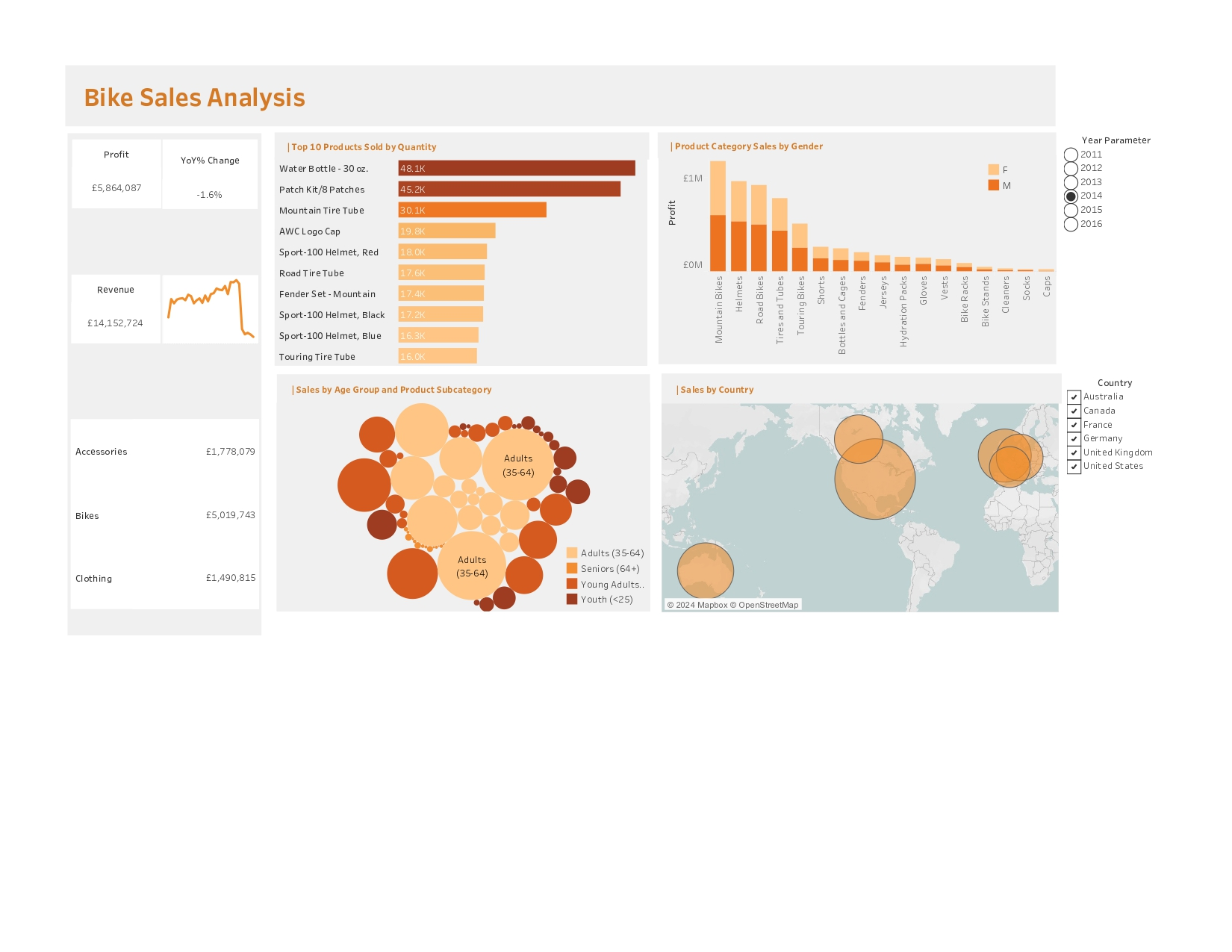
A strong problem-solver with a solid command of data extraction, transformation and visualisation, I am adept at data mapping, documentation and applying business rules to develop clean and reliable data models. Skilled in tools such as SQL, Power BI, R, MS Excel, Python and Tableau, with a keen eye for data quality, governance and process optimisation.

I bring excellent communication skills and the ability to present complex analytical findings to both technical and non-technical audiences, supporting evidence-based decision-making at all levels. Passionate about uncovering actionable insights and trends. I combine technical expertise with strategic thinking to drive business value through data.

Projects

R Shiny dashboard mental health Scotland
Project on Health data using R and ShinyApp

This project examines the impact of the COVID-19 pandemic on trends in mental health services in Scotland. It focuses on immediate and long-term shifts in psychiatric admissions, demographic disparities and regional variation. Using high-frequency, population-level data from Public Health Scotland and NHS Scotland (2018-2023), the study employs reliable quasi-experimental methods, Interrupted Time-Series (ITS) analysis and Mixed-Effects Regression modelling, to measure both sudden and sustained changes in service utilisation and diagnostic patterns. Interactive Shiny dashboard visualizes findings, informs policy and resource allocation. The ShinyApp facilitates stakeholder engagement, real-time monitoring, evidence-based decision-making and targeted interventions. Read More

Regression in Predicting Daily Collision
Predicting Daily Collision Counts (Python-DNN)

This end-to-end data analytics project explores the drivers of daily road collisions over eight years, combining exploratory analysis with two predictive modelling approaches: Linear Regression and a Deep Neural Network (DNN). Implemented entirely in Python on Google Colab, the project demonstrates proficiency in data cleaning, feature engineering, statistical analysis and TensorFlow-based model development.

This project illustrates a full analytics lifecycle from data ingestion and exploratory visualisation to advanced predictive modelling. It delivers actionable insights into collision dynamics. The combination of statistical rigour and machine learning sophistication makes it a compelling showcase for both data science and applied analytics roles. Read More

Power BI Classic Models dashboard
Classic Models (Power BI)

This Power BI dashboard explores sales and profitability for Classic Models Ltd, a retailer of collectible vehicles. It provides an interactive view of global performance from 2003 to 2005, helping managers identify profitable regions, products and customers.

Users can filter by year, month, product line or country to explore trends and compare performance. Designed entirely in Power BI Desktop, this project demonstrates strong skills in data modelling, DAX measures and storytelling with visuals. It turns raw sales data into actionable insights for operational and strategic decision-making. The analysis highlights the USA and France as leading markets and shows that Classic Cars consistently drive the highest profit. The dashboard illustrates how clear data visualisation can guide evidence-based business decisions and improve sales planning. Read More

Tableau Electric Vehicle Dashboard
Electric Vehicle Analysis and Dashboard (Tableau)

This Tableau project presents an analytical overview of electric vehicle (EV) adoption across Washington State. This highlights trends by vehicle make, model, type and geographic distribution. The dashboard integrates registration and ownership data to help policymakers, researchers and businesses understand patterns in EV usage and infrastructure needs.

The analysis focuses on Battery Electric Vehicles (BEV) and Plug-in Hybrid Electric Vehicles (PHEV), identifying Tesla, Nissan and Chevrolet as the leading manufacturers. Users can explore data interactively by county, year and vehicle type, gaining insight into how EV adoption has evolved from 2014 to 2023. Geographic maps reveal concentration hotspots such as King, Snohomish and Pierce counties, which collectively account for the highest EV ownership.

This is built entirely in Tableau Desktop, the dashboard demonstrates strong capability in data visualisation, geospatial analysis and interactive storytelling. It transforms complex datasets into an accessible, evidence-based tool for promoting sustainable transport and supporting data-driven policy decisions. This project showcases how visual analytics can bridge the gap between environmental data and actionable insights for a greener future. Read More

Power BI Coca-Cola Sales Dashboard
Coca-Cola Sales Dashboard (Power BI)

This Power BI dashboard provides a commercial overview of Coca-Cola beverage sales performance, designed for fast decision-making and executive reporting. It consolidates key commercial measures including total sales, units sold, operating profit, operating margin and average price per unit, giving stakeholders a single view of overall performance before drilling into detail.

The report supports analysis by product brand and geography. Users can compare performance across product lines (for example Coca-Cola, Diet Coke, Sprite, Fanta, Powerade and Dasani Water), identify which items drive revenue versus profitability, and review where sales and margin concentrate across states. A built-in driver-analysis view helps explain what contributes most to operating profit and margin, supporting insight-led conversations rather than “numbers only” reporting.

The dashboard is built to be self-serve: users can explore patterns quickly, validate assumptions, and move from high-level KPIs into root-cause questions such as pricing effects, product mix shifts and regional performance differences. The structure is suitable for monthly trading packs, performance reviews and stakeholder check-ins.

Read More

Tableau Bike Sales Analysis Dashboard
Bike Sales Analysis Dashboard (Tableau)

This Tableau dashboard analyses bike sales performance across multiple years, providing a clear view of revenue, profit and year-on-year change. It is designed for commercial and product insight, helping stakeholders understand what is selling, who is buying and where demand is strongest.

The dashboard breaks performance down by product and customer segment, including top products by quantity, category-level sales split by gender, sales distribution by age group and country-level performance. These views make it easier to identify which products drive volume, which segments contribute the most value, and where performance is improving or declining over time.

The layout is built for exploration and comparison: users can filter by year and geography to isolate trends, compare product categories and spot commercial opportunities such as high-performing markets, under-served segments, or product lines where profitability diverges from sales volume. This makes the dashboard useful for performance reviews, trading meetings and stakeholder presentations where quick, defensible insight is required.

Read More

Core Skills

Senior Analyst toolkit across data extraction, modelling, BI reporting, automation and stakeholder-facing insight delivery.

SQL & Data Modelling

Robust SQL for extraction, transformation, performance tuning and reusable views. Strong in dimensional thinking and building clean, scalable datasets for reporting and analysis.

Tools BigQuery, PostgreSQL, MySQL, joins, CTEs, window functions

ETL Data Modelling Optimisation
Power BI & DAX
Power BI (DAX / Power Query)

Executive-ready dashboards with strong KPI definitions, drill-down analysis and model-driven reporting. Focused on clarity, performance and stakeholder adoption.

Tools DAX, Power Query, data modelling, measures, RLS

KPI Frameworks Dashboards Performance
Python
Python (Analytics & ML)

End-to-end analytics in Python: data cleaning, feature engineering, modelling and automation in notebooks and production-style scripts.

Tools pandas, NumPy, scikit-learn, TensorFlow, Jupyter/Colab

Automation Modelling Feature Engineering
R & Shiny
R (Statistics & Shiny)

Advanced analysis and modelling in R with reproducible workflows, including exploratory data analysis (EDA) and regression. I build interactive Shiny dashboards for exploration, monitoring and research-led insights.

Tools tidyverse, ggplot2, dplyr, tidyr, caret, forecast, nlme, Shiny

EDA Regression Dashboards
ETL & Data Quality
ETL & Data Quality

Practical data engineering mindset: data validation, consistency checks, schema awareness, documentation and repeatable pipelines that reduce reporting risk.

Focus validation rules, reconciliation, monitoring, lineage basics

Data Quality Governance Reliability
Excel & Automation
Excel (Advanced) & Automation

Rapid analysis and operational reporting: complex formulas, Power Query transforms, PivotTables and VBA automation for recurring business processes.

Tools Power Query, PivotTables, VBA, INDEX-MATCH/XLOOKUP

Reporting Automation Data Wrangling
Data Visualisation
Data Visualisation

Clear, decision-ready visual storytelling: trends, drivers, comparisons and KPI narratives designed for busy stakeholders.

Tools Power BI, Tableau, ggplot2, Matplotlib

Storytelling KPI Reporting Usability
Stakeholder Management
Stakeholder & Insight Delivery

I translate business questions into analytics outputs: requirements gathering, KPI definitions, concise insight decks and recommendations that drive action.

Strengths requirements, prioritisation, exec comms, impact focus

Stakeholders Requirements Actionable Insights

Education

Contact Me